Hi lovelies! Now I’ve tried Sugarpill’s newest palette for a while and I’m loving it! ❤ I thought I’d tell you a bit about it today, show some swatches and compare the shadows to other eyeshadows. 🙂
The packaging is super pretty and cute, like all the other Sugarpill packaging. The palette itself has a blue cover this time, compared to the two other palettes in the Addicted to pretty collection, ”Sweet Heart” and ”Burning Heart”, which have a pink one. ^-^

The palette contains 4 colors, called Acidberry, Velocity, 2AM and Mochi. They are very vibrant, pigmented and to blend with these colors is super easy!

Here are the swatches I took of the eyeshadows. I’ve built up the colors in the pictures, so that you can see their full potencial! In the first picture, I’ve used a primer and in the second one, I haven’t:
With primer:

Without primer:

As you can see, there’s not a huge difference! I use primer in every look anyway, but I thought I’d show you how amazing the quality of these are, even without one! 😉
Acidberry is a bright, matte lime color, with slightly pearl sheen. This one is the least pigmented out of all of these eyeshadows, but it’s my favorite! The color is just so beautiful and vibrant and as you can see from the swatches, when you build them all up, Acidberry is equally as strong and good as the other colors! 😀
Velocity is the perfect royal blue! It’s a matte, bright eyeshadow! ❤
2AM is a matte, medium purple eyeshadow, with some pearl sheen to it. The color is kind of a mixture between Sugarpill’s Poison Plum and Dollipop, which i like, because it makes it blend very well in with these two!
Mochi is a light aqua, turquise color, which also has a slightly pearl sheen to it. It is matte and the most pigmented shadow in the palette. I think it’s a very unique color, because I’ve never seen one just like it! I’ve compared it with a few colors in this review, but they’re not super close to the color.
Here are a few comparisons:

These are the lime green eyeshadows that I have and I thought I’d compare Acidberry with the other two. Fuji and Acidberry are the most pigmented and as you can see, Acidberry is the most vibrant one out of them all.

Royal Sugar is my absolute favorite eyeshadow, and Velocity is a matte version of it. Very beautiful! ❤ I’ve also compared it to Sugarpill’s Afterparty, if you wanted to see the difference between them. 🙂 The MUG eyeshadow in Neptune can be a dupe for Velocity. MAC’s Marine Ultra pigment is also very close, but it’s a bit powdery and not as pigmented.

The closest eyeshadow I have to 2AM is Makeup Mekka’s shadow in Fetish. But 2AM is slightly darker and has a matte texture. The NYX color in the picture is from my NYX box of eyeshadows and doesn’t have a name.

These eyeshadows aren’t too similar to Mochi, but they were the closest ones I had. Here you can see what a light and beautiful aqua, turquoise color it is! ❤
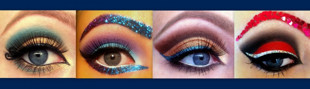
Here’s a look I did, using all of the colors in the palette:

All in all I’m very happy with this palette! From my personal taste, these colors are perfect! And I know I will be using them a lot, like I do with the other Sugarpill eyeshadows! If I’m going to compare them to Sugarpill’s other two palettes, they are just as pigmented, only lighter than the other shadows. Poison Plum, Love+ and Dollipop are slightly more pigmented though!
The eyeshadows are cruelty free and Acidberry, Mochi and Velocity are vegan as well. Each shadow contains 4 grams/ 0,14 oz of product. The palette costs 34 $ at www.sugarpillshop.com and you can also get the eyeshadows individually for 12 $ each. I think the price of the palette is great, because of the amazing quality and how much product you get! 😀
I hope this review was helpful! ❤
GlitterGirlC 🙂

I like your creations!
Thanks a lot! 😀
Looks wonderful!
It really is! ^-^
These look wonderful! I really want to get this palette and the Sweetheart palette but I’m too poor 😦 Thank you for the swatches, I can’t wait to see all the looks you do with these shadows!<3 😀
I’m so glad you liked the review, sweetie ^-^ If you’re ever going to save up for eyeshadows, the Sugarpill colors are the ones! Especially, since I know you love bright, gorgeous colors, like I do! ;D
Awesome review! I don’t have any other colours you use to compare Heart Breaker, but it’s good to see how they look together! They make them more unique:)
Thank you, Sakura! 😀 Yes, you can see that they really stand out! ^-^
This is a great review! I love the comparison swatches! It’d be cool if we could do a collaboration look, where we prompt each other with an esoteric statement to see what the other comes up with– then we could write a post on it! What do you think?
– zunnahzuthousand.wordpress.com
Thankv you! 😀 What is an esoteric statement? O:)
Liiike, “parisian seas”
Ah 🙂 Yes, we can definitely do that! 😀 I think I’ll give you “egyptian pharaohs” I hope I understood you right, hehe ^-^
Definitely! Okay, so how about we say we’ll finish this by… the 25th? And we can use whatever products we want, as long as it has some connection to the esoteric statement!
(Heehe, this is gonna be fun! 😀 )
Lots of fun! 😀 Yes, let’s say the 25th. ^-^ I thought I was going to pick one esoteric statement for you and you one for me x) But if we’re going to do a look from the same one, you can definitely choose which one we should do! 😉
Oh, actually, that’d be kind of interesting if we created a look from the same esoteric statement. 😀 How about “persian whispers”? I’d love to hear your ideas too! 🙂
How about we move this conversation to email… mine is zunnah_zu_thousand@yahoo.com
Let me know what you think! 🙂
hi,I’m inspired your look. this is my version http://mademoiselle-zu.blogspot.com/2012/06/kolorowy-koktajl.html 🙂 I add on my post that it was inspiration ofcourse 🙂 it’s not as good as yours but i think it’s really ok. kisses :*
Oh wow! Thank you so much for showing me this! 😀 It’s stunning, sweetie! ❤ I'm so flattered that you've been inspired by my look!!! 😀 xoxo
your work is amazing …do you have a youtube or facebook where i can find you?
Thank you very much! 😀 Here’s my facebook page: https://www.facebook.com/pages/GlitterGirlC/169478716487621?ref=tn_tnmn
I will have a youtube channel soon! ;D
I want this palette and the other SugerPill ones, but I am too poor. 😦 😉
They are at least worth saving up for! ;D Have fun with the MUG shadows in the mean time 🙂
Yay! Go MUG 😀
hehehe 😀